An effective branding kit is defined by its key features – a logo, fonts, colors, and graphics. Businesses that establish consistency across their branding kit are able to effectively communicate brand value and drive customer action.
Updated March 24, 2022
What is a Brand Kit?
A branding kit is crucial to all companies aiming to construct a distinct brand identity and distinguish themselves from competitors in the industry.
Branding kits function as a blueprint for how someone should represent your company, uniting all design elements in one place.
Creating this blueprint early will help your branding feel consistent and familiar to audiences over time. A uniform brand identity will help your customer base develop trust in your products or services.
Looking for a branding agency? Check out our list of the top service providers for your next partner.
How to Create a Brand Kit
Most kits start with the following core elements for brand marketing:
Use these design assets as the base of your branding kit to encourage uniformity and professionalism across your branding materials.
This article dives into each element’s place in your branding kit and how you can incorporate it into your kit on your own.
Logos Visually Embody Your Brand
Your logo is a simple design that should operate at the face of your business. It should visually communicate vital elements of your brand.
Find a logo design agency that can create the brand logo for your company's dreams.
It can be challenging to distill your complex and nuanced business operations into a simple brand mark, so it’ll likely take some time, design iterations, and reflection on your company values to get to the final design.
Once you’ve designated concepts that you wish to represent in your logo, document them. This way, you can include the completed logo along with the inspiring elements within your branding kit.
Establishing your process will help you tie your purpose back to your logo and connect viewers to the heart of your brand.
Airbnb does a great job combining, simplifying, and abstracting its mission and values to create a logo. Their branding kit includes images that inspired the final brand logo: people, places, love, and an “A” to represent Airbnb.
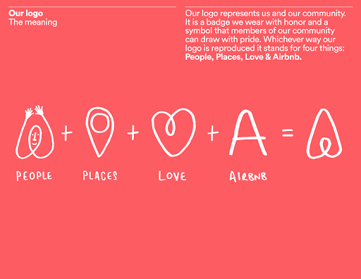
Source: The Branding Journal
The resulting logo is an abstract shape, but it’s also a precise combination of each core element. Readers can tell that the logo stands for people, places, love, and Airbnb within the branding kit.
Top logo designers also can help your business define and create a logo that best fits your brand.
A logo should keep the meaning of the company at the forefront. A branding kit is a perfect way to connect your logo to the greater purpose of your business operations.
Read this: ‘Old Logos v New Logos: Logo Redesigns & Consumer Responses’
Fonts Can Communicate Your Brand Message
Fonts and typography dictate the family of typefaces that marketers should use in all messaging about your company. Within your branding kit, font selections should be consistent and contribute to your overall brand personality.
Read this: ‘Typography in Logo Design: 4 Key Elements’
In addition to developing a creative personality, your chosen typography is responsible for verbally communicating messages to audiences. Therefore, it’s important to balance creativity with readability when selecting fonts for your branding kit.
For instance, Coca-Cola may be known for its iconic, curving font in its logo, but its font selections are much more simplistic.
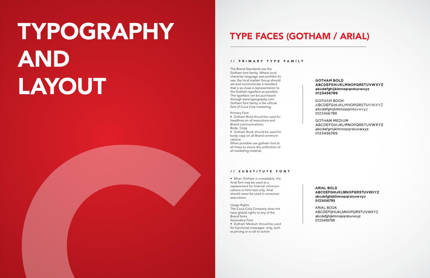
Source: Coca Cola Brand Equity Book
Rather than an “interesting” curving font that mimics its brand logo, the company uses simple sans-serif fonts in the Gotham and Arial families. These fonts are bold and easy to read in both large and small font sizes. Additionally, they translate well digitally, opening the door for optimized digital marketing materials.
Further, when establishing font standards for a business, differentiate which specific fonts should be used for headers vs. body text. Coca-Cola chooses to use a bolded font for headings, creating an easy-to-follow visual hierarchy in their branded materials.
Font standards will keep your branding kit consistent with written content and ensure customers can easily interpret marketing text and copy.
Color Palettes Elicit Responses From Your Customers
Color is an essential element in building a brand identity.
Effective color palette selection does more for your brand than just keeping its look consistent. It’s been proven that color is a critical factor in helping customers develop brand recognition.
Moreover, consumers’ associations with the color palette you select for your brand colors will impact how they perceive your company.
For example, green elicits feelings of the natural world, so it makes sense that brands like Whole Foods would want it to be part of their branding kit.
Other companies, such as Netflix, may choose to employ bright colors as a means of attracting attention and standing out from competitors. The current colors for the Netflix brand mark are both reds: Netflix Red and Symbol Dark Red.
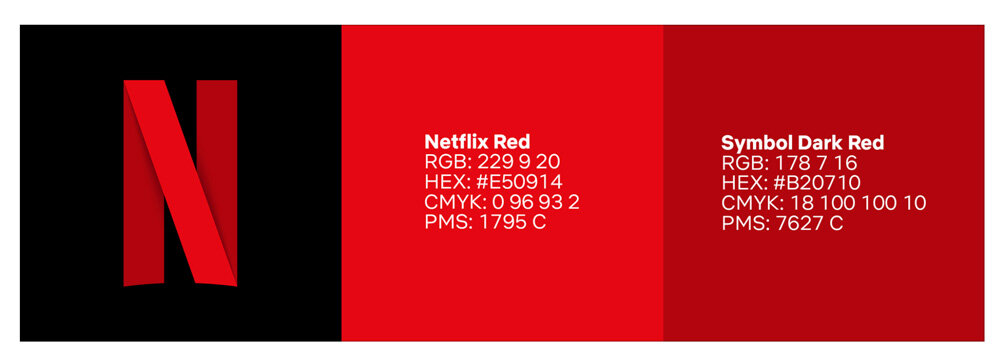
Source: Klara Cu
Studies show that red is commonly used in competitive markets to catch the eyes of prospective customers. When Netflix first entered the market, it was competing with established media giants such as Blockbuster. The prominent red color in the company's branding kit may have caught consumers’ attention in search of a new, differentiated media solution.
The color palette is a key part of any branding kit. Make sure to be discerning with color selections and how an audience may respond to them when putting together your guidelines.
Additional Reading: 'How Your Website Can Use Colors That Increase Sales'
Graphics Keep Customers Engaged With Your Brand Identity
Apart from your logo, your brand will undoubtedly have other graphics, images, and patterns to make up your brand identity. You should include these graphic elements in your branding kit.
Other graphics can include:
- Icons
- Patterns
- Secondary logos
- App design elements
Language education platform Duolingo artfully incorporates relevant graphics into its branding kit. Most notably, this includes Duo, a green cartoon owl that serves as the product’s mascot.
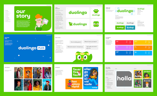
Source: Johnson Banks
Duo is posed in different positions alongside the company name within the logo design overview section of the kit. Duo’s face is even used as the mobile app icon.
Within the branding kit, Duolingo determines the most effective ways to showcase their mascot and encourage users to keep up with learning new languages.
Your branding kit is a great place to detail how your team should execute certain graphical elements to communicate your brand identity.
Developing standards for patterns, mascots, and other graphics will ensure that imagery treatment is just as uniform and consistent as your primary logo.
How Do You Create a Branding Kit?
A great way to start developing your branding kit is by determining logos, fonts, color palettes, and other graphics for your company. From there, there are plenty of options for putting together the final set of guidelines.
After defining your goals, you may opt to partner with a branding or design professional to create a professional-grade branding kit.
However, if you have solid ideas for all the kit components, you can also put the branding kit together. There are several templates and platforms available to make creating brand guidelines seamless, even for non-technical professionals.
Once you’ve determined a course of action, execute building the brand book and share it with your team. From there, you’ll be on your way to cultivating a uniform, unique brand identity.
Start creating your branding kit today with one of our service providers.
Additional Reading: