A well-designed landing page can increase conversions and generate leads. These Divi landing page examples show how designers use Divi’s drag-and-drop features to create beautiful and functional sites.
It takes less than a second for a potential customer to form an opinion about your website, swaying their decision to make a purchase. As a result, web design is an essential part of your business strategy. By creating a great first impression, you can improve your conversion rate, generate leads, and even boost your SEO.
As the first page that a potential customer sees on your website, your landing pages need to grab their attention and establish your business’s credibility. To enhance their web design, many businesses rely on Divi to create engaging and visually appealing platforms.
Divi is a WordPress theme and plugin that has visual drag-and-drop features. This makes it easy for beginners to design a beautiful and functional WordPress site, even if they don’t understand coding languages such as HTML, CSS, or PHP.
Using this tool, businesses are able to add the features and functionality that they need to convert users on their site. Here’s how other web design companies have put Divi templates and features to use.
1. Casa Los Silvestres Uses Animation to Grab Attention
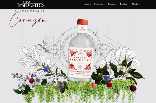
Source: Casa Los Silvestres
Casa Los Silvestres, a company that produces Oaxacan mezcal, used Divi to add photos and animation to their site. As the site loads, a hummingbird sketch appears to flap its wings. Then several layers of other pictures appear and arrange themselves to form the hero section.
A hero section is when the full screen on a landing page consists almost entirely of an illustration, image, video, or animation, but can also include some text and a call to action. This is a great way to grab a user’s attention, and Casa Los Silvestros implemented it perfectly — the site’s features are unique and clearly support the company’s brand.
The site also features a lot of movement. Once the hero section is in place, the visual elements seem to float around slightly. Other sections feature a ripple effect when a user moves their mouse.
In addition to enhancing the design, animation like this can improve engagement. In fact, people are hardwired to detect motion, so the effect is very eye-catching.
On top of that, the platform is easy to navigate. The top right includes a navigation bar so users can easily learn about products, how they’re made, find recipes, and shop online.
2. Mothers at Risk uses a Video to Evoke Emotion
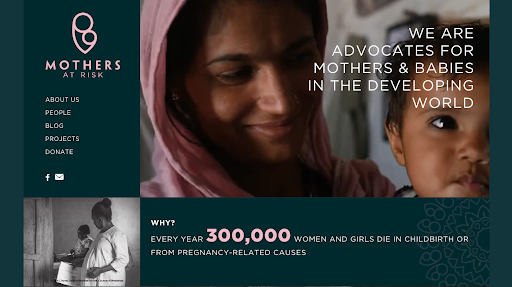
Source: Mothers at Risk
Mothers at Risk is a nonprofit that advocates for maternal health in developing countries. They used a box design to draw eye to the four main elements of the page — a video of a mother and child, a menu, statistics about their cause, and another picture of a mother and child.
This design highlights the organization’s purpose, making it very clear what they do to users who visit the page.
As users scroll down, they can view more details about the organization, what projects they’re working on, and click on a CTA that invites users to get involved.
The site does a great job of promoting the organization’s brand by consistently using their color scheme throughout the website. The background color is a dark green, and they use a light pink to highlight CTAs and important information. They also use a white font to contrast the background, making it easier to read.
However, the most impactful element of this design is the video feature at the top of the page. The short clip features a smiling mother and child. This clip emphasizes the importance of their cause and humanizes the people who the organization helps.
As a result, this video appeals to potential partners and donors on an emotional level, making them more likely to convert.
Even for businesses, including a video on your landing page can be very effective because they engage your audience and help them absorb information. To create the perfect clip for your landing page, consider collaborating with a video production company.
3. Mira Highlights their CTA to Increase Conversions
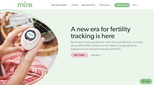
Source: Mira
Mira, a fertility and ovulation tracker, seeks to convert users by highlighting their CTAs several times on their webpage. Their primary CTA, “Buy Now” is featured at the center of the landing page, drawing the user’s attention. The button is pink, so it stands out against the green background.
Scrolling down the page, they feature three other call-to-action buttons for buyers. However, they also include subscription buttons, helping them collect customer information for the email marketing efforts.
They’ve also included interactive elements, such as a fertility quiz, to persuade potential customers to buy their products.
Use Divi to Build Your Landing Pages
Divi’s easy-to-use templates and drag-and-drop features help web designers create unique landing pages that are more likely to convert. For example, Casa Los Silvestres was able to create a unique animation that featured their products. Using movement throughout the page, they are able to grab their audience’s attention.
Mothers at Risk was also able to include videos and a unique color scheme to easily convey their mission and brand.
Finally, Mira, used Divi templates to highlight their call-to-actions and increase sales.
By creating engaging platforms with Divi, your business can increase sales and boost your brand awareness.