An intuitive mobile menu design can improve user experience, attract returning visitors, and increase your conversion rate. Here are 3 design ideas that can improve site navigation for mobile users.
Updated September 28, 2022
Mobile accounts for about half of all web traffic, and compared to using a desktop, the experience is completely unique.
Small screens on mobile devices means that designers need to be smart about how they utilize space. At the same time, they must consider the ergonomics of how users interact with the platform. Rather than using a mouse, visitors on a mobile device navigate the platform using their thumb.
These distinctions create a vastly different experience for users on mobile devices. In order to remain competitive, companies must adjust their web designs to ensure a friendly UX on mobile devices.
Your website’s menu plays an important role in creating a seamless experience for visitors — it guides them through the site and helps them find the information they need.
By improving your navigation features, you’ll improve the impressions people have of your brand, attract returning visitors, and increase your conversion rate.
Here are 3 menu design ideas that will help you optimize space on your mobile site and increase usability within the navigation design:
Hire a UX designer to assist with your mobile app's UX/UI design.
Bottom Navigation
Traditionally, most websites feature their navigation menus across the top of their pages. This is great when scrolling through a desktop website because it’s easy to spot. Right away, customers can find what they’re looking for.
For mobile websites, though, that design doesn’t quite meet a user’s needs. Most mobile users hold their smartphones in one hand and rely on their thumb to navigate between websites, apps, text platforms, and more.
However, the average smartphone’s screen size is between 4.7–6.5 inches, while the average human thumb is less than 3 inches long, meaning that most of what is on a mobile screen is out of reach.
This means that web designers can’t think solely about how the site looks, but rather must think about the ergonomics of their designs.
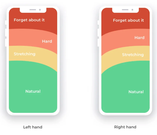
Source: Smashing Magazine
Based on how people generally use their mobile devices, this graphic shows just how easy — or difficult — it is for users to reach certain parts of the page. Clearly, the bottom is easiest for users to access, so designers have adjusted their menus and submenus to meet their needs.
For example, a web designer created an animated sliding tab bar and included it at the bottom of this finance app.
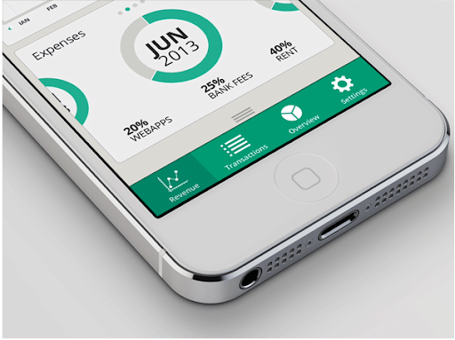
Source: Behance
With all of the icons well-within the natural reach of a user’s thumb, the platform is easy to use and follows navigation patterns. However, there are some limitations associated with this design. With such a short space from side to side, it’s difficult to fit more than just a few menu options and icons on the screen.
Consequently, web designers shouldn’t include more than five options at a time on this menu. This platform has stuck to that rule well; they’ve only included four menu options.
If they needed to include more navigation options, though, the designer may have opted for a more compact menu design, such as a hamburger menu or grid design.
Additional Reading: ‘UX Design vs. Web Design: Key Differences’
Hamburger Menu
Hamburger menus look like a burger between two buns, or three horizontal lines stacked on top of one another, and often appear in the top corner of a website. This design is particularly popular for mobile navigation because it can fit on smaller screens and doesn’t take up too much space.
Visitors must click on the button to view or hide the navigation options included on the menu.
For example, Amazon utilizes a hamburger menu on their mobile site. The icon appears in the top left hand corner next to Amazon’s logo.
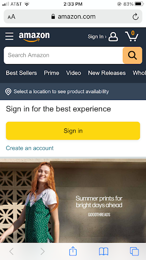
Source: Amazon
Once site visitors click on the icon, a larger drop down menu appears on the sidebar of their screen, like this:
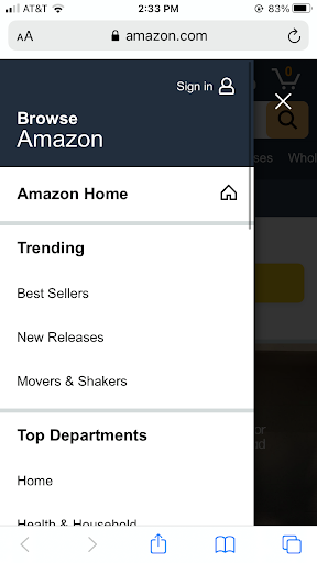
Source: Amazon
Although this design utilizes space more efficiently than a traditional navigation menu, it can pose some problems for your user if not organized properly.
If the hamburger menu itself is difficult to find, you risk frustrating your users, causing them to leave your mobile site. Therefore, designers should make sure the hamburger icon is large and easy to spot on the page.
At the same time, they should make sure that the drop down options are large and easy to click on. Small fonts make it difficult for users using their thumb for clicks. Still, they’re a great navigation option when you need to include a lot of options.
Read this for design inspiration: ‘12 Design Portfolio Websites to Inspire You’
Grid Navigation
Similar to the hamburger menu, grid menus are a great way for web designers to optimize space on a mobile website or mobile app. Instead of three lines though, it utilizes a 3x3 box to indicate multiple options. Once a user clicks on the icon, they will see additional navigation options.
Google uses a grid navigation so users can find their other apps such as Gmail, Calendar, and Google Ads.
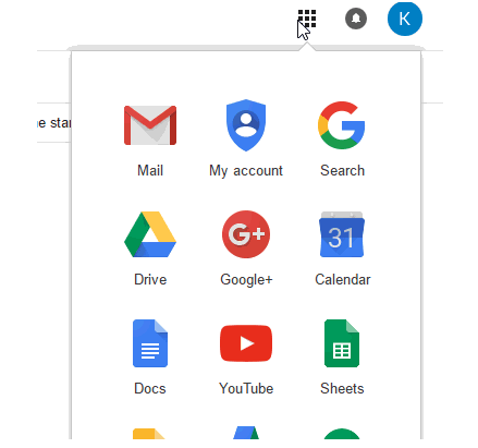
Source: GSuite
This design provides an excellent user experience and is very on-trend. Unlike a traditional drop down menu, this design often features menu icons to show different options. The imagery makes it easier for users to scan through your options and find the content they’re looking for.
Additionally, the larger blocks associated with images, make it easier for users to click on using their thumbs.
Top-level changes to the user interface of a mobile app design can make it more user-friendly for all parties, prompting more users to engage with your services.
Improve Mobile Navigation with These Menu Designs
It might be time to redesign your homepage on mobile.
As people rely more and more on their smart devices, creating a mobile-friendly site is essential. Your site’s menu helps users navigate your platform and find what they’re looking for. Consequently, they’re important for creating a seamless user experience.
When designing a menu for a mobile website, creators need to consider the space it takes up as well as the platform’s ergonomics. To address these issues, many designers focus on moving navigational tools to the bottom of the page.
However, the limited space on the screen means that designers can’t list all of their links across the bottom of the page. Instead, they rely on space-saving features like hamburger and grid icons. Once users click on them, a larger drop down menu appears.
By utilizing these menu designs, you can optimize your site for mobile and improve your conversion rate.
Hire a web design agency to better your digital products.
Additional Reading: