Understanding what a mobile website is and how to optimize your website for mobile helps ensure users have a quality experience with your web content on their mobile devices.
In 2015, when mobile started outperforming desktop for web traffic, the importance of an effective mobile website was cemented.
That was almost 6 years ago. Your business needs a mobile website.
Mobile devices have smaller screens, more restrictive interaction, and often slower or less reliable connections. You must do all you can to ensure a potential customer’s mobile user experience is as good as the experience of someone using a desktop.
Start by checking for these seven elements of web design for your mobile website.
Improve Page Load Speed
Long load times for a web page can kill your conversion rates. People don’t want to wait to learn about your product and make a purchase.
Mobile access uses different software, hardware, and video than desktops. As a result, page load times are different: the average webpage takes more than 25 seconds to load on mobile. That’s terrible for two reasons:
- Consumers will leave your site before it loads
- That bounce rate and slow loading speeds hurt your rankings on Google
1. Scale Content for Mobile Screens
Scaling down desktop content and pages to mobile causes all kinds of problems. For example:
- The user might have to scroll and slide all over the screen to get a full picture of the site
- Text and images could be too small to see easily
- Your logo and menu could force them to scroll too far before finding what they want to see
- Call to action (CTA) buttons may not appear in intuitive places on the page
This kind of frustrating experience can kill any chance you had at turning a casual browser into a qualified lead
2. Opt for Banner Advertisements Over Pop-Ups
People hate pop-ups even on the large screens of desktop navigation. They get in the way of accessing information, which is the only reason users come to your site in the first place. Users need to be engaged with your content: Design your website to facilitate that.
On a mobile device, they’re even worse. They tend to block all the information, and the little “close” icon can be hard to see and harder to press. They alienate viewers, creating a negative experience.
Ad agencies would suggest you opt instead for banner ads. This gets your message front and center without interfering with the user’s quest for information.
3. Optimize Your Site for Mobile Indexing
In 2018, Google began indexing mobile sites as a domain’s main version to match the fact that most web searches now come from mobile devices. This shift resulted in adjustments for what content it displays on search results:
- Pages with a robust mobile option outrank similarly optimized pages
- The default version of the site users land on when clicking through on search results, even in searches made on a desktop.
Taking advantage of this requires may require you to rethink SEO services for your website. For example, you need to:
- Make sure your mobile and desktop pages display the same content
- Confirm both versions have appropriate metadata and structured data
- Verify both versions in Search Console
- Use rel=hreflang tags\ so mobile and desktop links lead to the most appropriate place
The good news is ranking still takes place by the page, not for your entire site.
If you are on a time or budget to hire a web design company, you can make these changes for your most important pages first and immediately reap the benefits, rather than retool your entire website.
4. Ensure All Images are Mobile Responsive
“Mobile responsive” means your website has a brief conversation with a user’s device before loading. It finds out what size display it’s about to be loaded on, then sends a version of your page most appropriate for the device in question.
Without this feature, your website may show huge images on a screen too small to render its entirety.
It could bury your CTA and headline so that they require too much scrolling. It could try to show a landscape-oriented page on a portrait-oriented tablet or phone. None of this benefits your company or the person trying to do business with you.
5. Space Content for Touch-Friendliness
When you build a website optimized for somebody to click on your various links – CTAs, buttons, images, and widgets – it works well for desktop users. It’s easy to control and a mouse offers pinpoint accuracy.
Contrast that experience to using a finger on a tiny screen. Most of us have had the experience of trying to tap an element that’s too small or crowded too close to other buttons and links. It’s deeply frustrating. How long did you keep trying before you gave up and played Candy Crush instead?
This is one of the easiest issues to fix. Just space the essential click/touch elements appropriately, and have the person on your team with the biggest hands test them out before you go live.
6. Optimize CTAs for Mobile
CTAs often are the whole point of a web page. Make your CTA easy to find and easy to use.
For your mobile version, make sure it’s impossible to miss while browsing the information and that it’s easy to tap amid other screen elements.
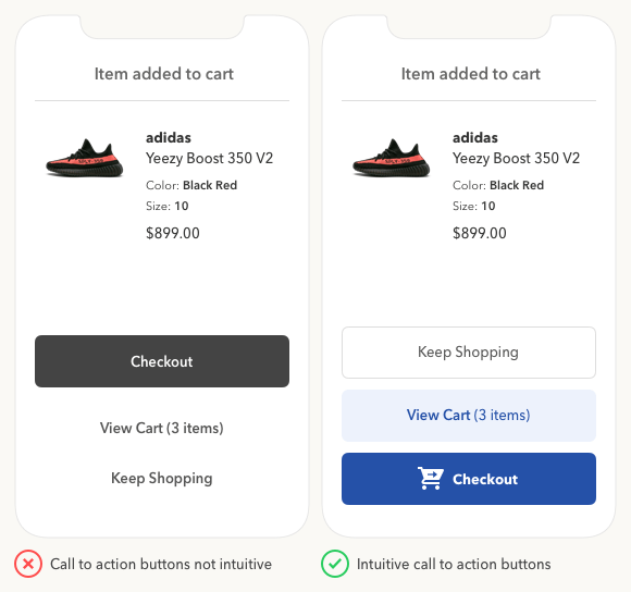
Source: UX Movement
It’s also important to build forms that work efficiently. Potential customers will be turned off quickly if you make entering their information difficult. Be especially careful of how a pop-up interacts with the information they still need to see. If the keyboard covers this information up, they might never reopen the keyboard to finish the job.
Understanding a Mobile Website Allows Businesses to Benefit From Them
Learning what a mobile website is and how to develop a functional mobile user experience is crucial to ensuring critical user engagement with your web content.
Understanding common pain points with mobile website design helps businesses benefit avoid common website mistakes.