With competition getting tighter in the mobile app arena, your app must stand out in the crowd with its flawlessness. Even a tiny mistake can push the user away. The article helps you avoid common mobile app design mistakes that even veteran app designers often make.
Mobile apps help your business in more ways than you can imagine. A mobile app opens new revenue streams, enables customized content, is closer to the target audience than a website, and gives a rich user experience.
Chances are, your competitors have already invested in mobile apps. It’s important that you introduce an app with exceptional UI/UX and intriguing features.
While working as the Senior Digital Content Producer at Cubix, a leading mobile app development company in the United States, I’ve seen some clients insist on taking design inspiration from their competitors.
However, it’s crucial that you build a unique brand identity with your mobile app if you wish to cash the platform. Avoid cutting corners. When it comes to mobile apps, it takes time to craft a masterpiece.
Users will always notice mistakes, even if designers fail to see them while building the app. In this article, I’ll walk you through the most common mistakes that designers miss, and explain how to avoid them.
How to Avoid 5 Common App Development Mistakes
- Design your interface for mobile devices
- Entice new users with experiences
- Create a logical, intuitive UX
- Be original when designing
- Leave enough negative space
1. Design Your Interface for Mobile Devices
Your mobile app should reflect your brand’s essentials and have a similar theme to your website.
Remember, though, that mobile apps are poles apart from websites. You can’t treat and design your mobile app the same way as your website.
Some mobile app designers forcefully integrate the client’s website design into the mobile app, compromising on quality, aesthetics, and effectiveness of the app.
Mobile phones have smaller screens than desktops and laptops, which means that fewer elements can fit in one screen.
It is better to give the app a different look and feel. If you try to include all of the website’s elements you risk overloading users’ screens with features and damaging the overall user experience.
2. Entice New Users With Experiences
User downloads and logins are two of the most crucial key performance indicators (KPIs) for mobile apps.
Encouraging app users to register is one thing, but forcing them to do so is another. Some users are wary of apps having too much information. Do not make it mandatory for users to sign up or register to use the app.
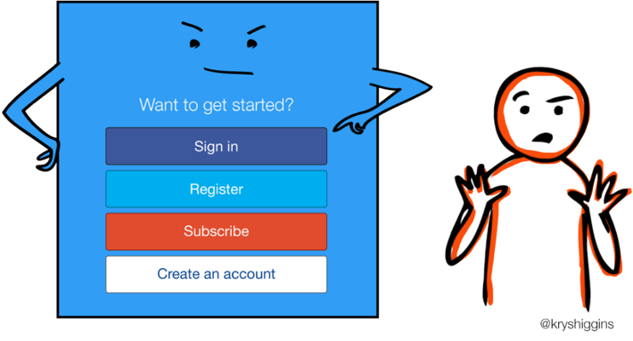
Mobile app users, like myself, don’t like giving their email addresses and other contact details to every app. Most users don’t like signing up and getting unnecessary notifications unless they know the app offers exciting content.
To get users to sign up for your app, offer some experience without asking anything in return. For example, if you are designing a marketplace, let users explore the products before prompting them to subscribe.
Instead, you can ask them to sign up to add products to the cart and complete the order. If you’re launching a news or blogging app, let users read the headlines and then ask them to sign up to read the complete story.
Give users some time to decide whether they want to sign up or not. And while they are exploring, focus on convincing them to stay and register.
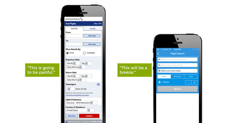
3. Create a Logical, Intuitive UX
Some designers assume the user knows how the mobile app works and forget to cover the basics.
You have worked on the app for countless hours, so you know how and where to look for any information. Remember that your user doesn’t have this knowledge.
Make sure your user experience (UX) is intuitive and clear. Place the information in front of the users to find.
Don’t expect or make users make an extra effort to find product information, availability, return policies, and more. Give all the necessary information up front so users don’t get frustrated.
It is vital to keep the design simple to avoid confusing the user. Your target audience likely has a bunch of apps on their phones already. I recommend looking at the most popular apps in your market to identify standard practices for basic operations.
Lastly, avoid jargon. We all know what a shopping cart is. Using another word for it will only confuse the user and do no good.
4. Copying the Competitor’s Designs
The worst thing you could do is copy a competitor’s designs and lose your own identity.
Customers often explore apps from more than one seller before purchasing. This means there is a high chance that your target audience knows what your competitors’ mobile apps look like.
Copied designs reduce user retention because users won’t find any new information worth remembering. Users also question the credibility of businesses that lack creativity and uniqueness.
Copying designs from a competitor makes it harder for you to set your app apart from the crowd. It also leaves you dependent on the competitor to change and evolve, so you can too.
5. Leave Enough Negative Space
Some app development companies add too many elements, leaving too little negative space between buttons and causing confusion for users.
It’s okay to leave some space empty. The negative space gives a sleek look to the app and organizes the content efficiently.
If the space is too cluttered, it might cause users to lose faith in your brand and drive them away from the app.
Negative space and clean lines show the user that you, the designer, cared enough to design an app that would be easy for them to use on a smaller screen.
You don’t want users tapping Cancel instead of Complete Order because the buttons are tightly squeezed. Cluttering is also frustrating to new users.
Make Your App Stand Out by Avoiding Common Mistakes
Don’t worry if you’ve made these mistakes in the past, or if you’ve never really thought about their impact on user experience. Even some of the designers at Cubix have made some of these design mistakes.
Remember to keep your designs clean and user-friendly. Make sure you optimize your design for mobile and avoid copying your competitors or pressuring your audience to register for your app.
Avoid these 5 common mistakes and your app will stand out from the competition.