Companies use their logos to help potential customers identify a business based on particular fonts, colors, and designs. Redesigning a logo can be a big deal because old company logos are integral to brand identity for many businesses. In this article, we review redesigned logos from popular technology and retail brands introduced in 2019.
UPDATED: January 11, 2022
Several popular brands redesigned their logos in 2019. Some new logos, such as Facebook’s, sparked controversy and debate. Other logo redesigns, such as Zara’s, went mostly unnoticed.
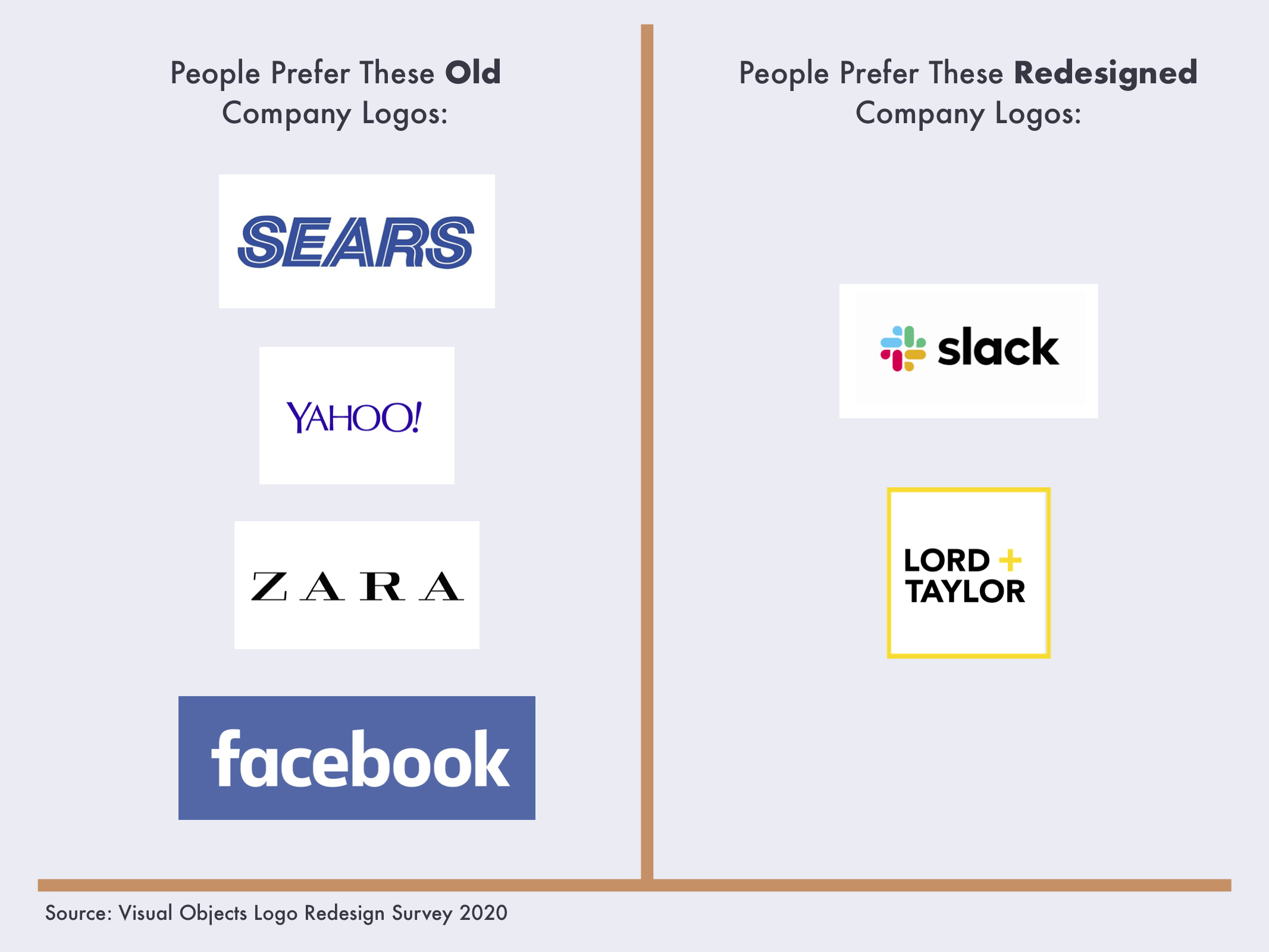
Consumers are mostly resistant to change, preferring old company logos. People prefer only Slack and Lord & Taylor’s logo redesigns over their previous logos.
The best logo redesigns stick with customers in a positive way.
We surveyed 1,000 consumers in the U.S. to see how people feel about company logo redesigns and the new logos of companies.
Our Findings
- Most people prefer the old logos of Facebook (80%), Sears (79%), Zara (56%), and Yahoo (58%).
- People prefer the redesigned logos of Slack (73%), and Lord & Taylor (63%).
Facebook: People Like the Old Logo
Facebook redesigned its iconic, lower-case blue logo in 2019, and many consumers were unhappy with the change. The updated logo dropped the well-known, lower-case design in favor of a sleek, all-caps look.
According to our 2019 survey, 80% of people prefer Facebook’s old logo to the company’s new design.![]()
The new logo’s all-caps styling and the color-changing font was not well-received by users, with only 20% of respondents saying they prefer it to the old Facebook logo.
The new design also lets Facebook modify the logo based on its subsidiary brand colors, shifting from the distinct blue to the multicolored tones of Instagram and WhatsApp.
![]()
The multicolored options for the redesigned Facebook logo create more transparency around the other apps and platforms Facebook owns.
People, who generally dislike the new logo, posted memes and Twitter comments in response to an NBC tweet about the redesign, which read “Facebook announces that it is now FACEBOOK.”

Many tweets and comments critiqued the all-caps logo and tied it to scandals involving the company’s handling of racism and conspiracies on the social media platform.
Professional designers also critiqued Facebook’s redesigned logo, including the dynamic color palette.
“A shifting color palette might look good in GIFs, but it makes branding consistency difficult and can lead to confusion about the correct way to present the logo in different contexts,” said Dawson Whitfield, founder of logo design software company Looka.
Despite the sleek upgrade and attempt at increasing transparency, Facebook’s new logo is less popular than the original among most consumers.
In 2021, Facebook also made another change that was criticized by consumers. The company became meta.
To reflect their growing ambitions beyond social media, Facebook changed their company name to Meta.
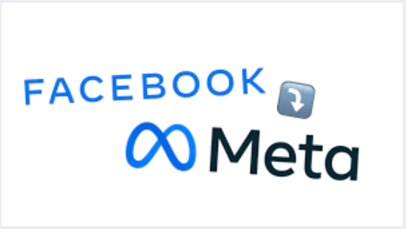
While it’s still early days to know how Meta will take over the online world, it is clear that the negativity of Facebook in the news isn’t overshadowed by the new name and logo.
It will be interesting to see how Meta transforms the internet and design spaces as it becomes more of a staple in the consumer mindset.
Yahoo: People Are Divided on the New Logo
Internet company Yahoo introduced a subtle change to its logo, but people still prefer its previous version.
Just over half of people surveyed (58%) say they prefer Yahoo’s old logo, with all-capital letters and thinner font, to the new, all lower-case logo.
![]()
Just 42% of people prefer the new logo from logo design company Pentagram, which kept the same purple brand colors but added a thicker font.
The change inspired headlines such as “Yahoo redesigns its logo to remind you that Yahoo exists” from The Verge, highlighting consumer ambivalence toward the change.
Unlike many other Silicon Valley companies, Yahoo is an older internet company with many logo and branding changes under its belt.
![]()
The new logo keeps the sans-serif font the company adopted in 2013. Sans-serif fonts remove the “serifs,” or small lines on larger letter strokes. Sans-serif fonts are popular with contemporary technology companies such as Facebook, Twitter, and Google.
Unlike Facebook, Yahoo’s updated logo was well-received by more than half of users, who are accustomed to the brand’s shifting faces.
Additional reading, ‘Typography in Logo Design: 4 Key Essentials.’
Slack: People Prefer the New Logo
Slack is a popular instant-messaging tool many businesses use for internal communication. Slack recently redesigned its logo, changing from the original, recognizable hash-symbol design to a new icon.
Almost three-quarters of people (73%) said they prefer Slack’s redesigned logo to its old one.
![]()
The new logo keeps the colors the same in the icon but changes the design from its old hash symbol.
When asked for comment, Slack directed us to a thoughtful blog post outlining its reasons for the change, including the opinion that the original logo was “simply awful.”
“[The new logo] uses a simpler color palette and, we believe, is more refined, but still contains the spirit of the original. It’s an evolution, and one that can scale easily, and work better, in many more places,” the post read.
The new Slack logo is an example of a tech company redesign that resonates with consumers and streamlines the brand, using the same colors to create an updated and cohesive design.
Zara: Consumers Are Split on the Logo Redesign
Popular Spanish clothing retailer Zara changed its logo in 2019. It kept the black-and-white text, but instead of thin letters spread out, the letters are larger and overlap.
A little more than half of people (56%) prefer Zara’s old logo, and 44% prefer the redesign.
![]()
This was only the second logo change in the company’s 45-year history. The change was so slight that many casual consumers might not have noticed at all.
“As a 'fast-fashion' brand, Zara is not original or known for quality,” said Jeilan Devansen, of infographic software company Venngage. “The newest logo redesign conveys a bit of elegance and sophistication to distinguish itself from similar fast-fashion brands such as H&M.”
Zara's old logo resembles high-end brands such as Versace, whose 2008 logo features more space between letters.

As consumers move away from fast-fashion, Zara’s new logo may help consumers associate the company with higher-end retailers.
Sears: Most Prefer the Old Logo
The Sears brand redesigned its logo after closing 175 stores in 2018. Instead of inspiring customer loyalty, however, the new logo doesn't have many new fans.
More than three-quarters of consumers (79%) said they prefer the old Sears logo to the redesigned one.
![]()
Sears is trying to rebound from the “retailpocalypse,” a common phrase for the shifting consumer demands of the retail and fashion industries.
“Retail logos like Sears have become more sleek and crisp, partly to prove they are no longer 'dated' or the same old-school retailers that our parents and grandparents grew up shopping,” said Baron Hanson, owner and lead consultant at RedBaronUSA.
In Sears’ case, unfortunately, the new logo hasn’t caught on with consumers, with some comparing the new shape to the logo of popular vacation home rental company Airbnb.

The similarities to Airbnb's logo could further alienate the younger consumers Sears is trying to attract because it could be seen as copying.
If they want a newer and younger customer base, Sears will have to do more to rebrand its image than change its logo.
Lord & Taylor: People Prefer the New Logo
Unlike Sears, Lord & Taylor’s contemporary logo was well-received by consumers.
The oldest department store in the U.S. left stylized calligraphy behind in 2019 in favor of a modern take on the brand.
Consumers responded positively, with 63% preferring the redesigned logo to the old one.
![]()
Like the Sears logo, Lord & Taylor’s redesign includes bright colors and a simple, sans-serif font for digital consumers.
Logos like these are part of retail’s growing trend toward digital-friendly designs, rebranding from designs created in the traditional advertising age of billboards and catalogs.
“Longtime brands such as Lord & Taylor have had to consider just how hard their cursive or 'calligraphy’ logos can be for users to read on constrained mobile app screens and other online and digital marketing platforms,” Hanson said.
The new Lord & Taylor logo will provide an improved digital user experience on mobile apps and browsers.
Logo redesigns can help retail brands stay relevant in turbulent times. Lord & Taylor's redesign was a well-received update to a dated brand.
Consumers Are Hesitant to Embrace Logo Redesigns
Several companies changed their logos in 2019, including some major technology and retail brands.
On the whole, consumers prefer companies’ old logos to their redesigns, with the exceptions of Lord & Taylor and Slack.
Logos are a critical part of a company’s brand. Logo redesigns can be risky when a logo is so closely tied with brand identity.
Brands should consult with experts ahead of any major logo redesigns or risk losing consumer support.
Find the right logo design agency for your business by browsing our directory.
About the Survey
Visual Objects surveyed 1,001 people in the United States about redesigned logos and old company logos.
Less than half of respondents (44%) identified as female, 36% identified as male, and 19% declined to self-identify.
One-fifth of respondents (8%) are ages 18-34, 12% are ages 25-34, 25% are ages 35-54, 32% are 55 and above, and 23% declined to identify their age.
Respondents are from the Midwest (28%), Northeast (16%), South (33%), and West (23%).
Additional Reading