Right now, thin lines, simple colors, and transitions are popular animation trends. Add these types of animations to your mobile app to improve your user interface.
People process visual images 60,000 times faster than text. We need less than 0.1 seconds to notice moving objects.
From working on dozens of animation projects, designing various interfaces, and conducting comprehensive research on user interfaces (UI), I decided to gather all valuable insights about how to use UI animations to spruce up a mobile app.
Specifically, upcoming animation trends can be characterized by thin lines, colour simplicity, unusual fonts, shape transitions, tricks with dimensions, and much more. Let’s start with an overview of how you can implement these trends into your products.
- Linear Art Effect
- Color Laconism
- Brave Typography
- Morphing
- 2D+3D
- Logo animation
- Grain
- Buttonless Transitions
- Futuristic Animations
- Roughness
1. Linear Art Effect
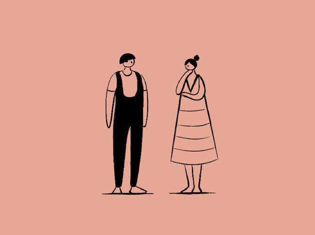
Get ready to see lots of thin and distinctive lines in the upcoming months. Linear art is gaining momentum. The trend is to integrate thin lines in both static elements and videos. Thin lines create an impression of a hand-drawn effect and make your videos more original and unique.
For example, this animation on Hello Monday’s website perfectly demonstrates the studio’s creativity.
Source: Radio
In the animation, the figure on the right is able to change the size, shape, and look of the figure on the left with just a swipe of her hand.
The thin lines make the animation look like it was just sketched on a piece of paper, but now it has come to life.
2. Color Laconism
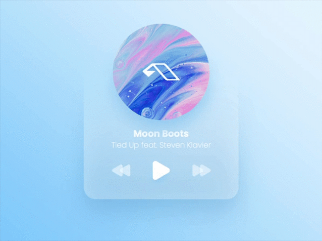
Minimalism and simplicity animation trends apply to colors as well. Rather than use a rich palette of colors, consider focusing on two or three colors to make any design more sophisticated and expressive.
In this animation, the designer used shades of light pink and blue to create a minimalist player widget.
Source: The Glyph
The bright colors catch the user’s attention and encourage them to interact with it. Additionally, the enhanced user interface (UI) makes it easier for users to interact with it.
The Glyph is not alone in using color laconism — Apple, Acne Studios, Airbnb, and Evian have already caught on to the trend as well.
3. Brave Typography
We all got used to thinking that fonts are something untouchable and unchangeable, but not this year. Traditional typography is no longer in demand.
Instead, new or unique typography is becoming more popular. The new trend opens up ways to express your brand’s ideology, reflect its values and impress users.
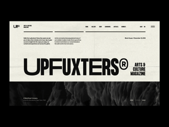
For example, this monochrome website layout relies primarily on typography to create visual hierarchy.
Source: Matt Thompson
To make it look unique, this designer used a sans-serif typeface, but played with the size and width of each letter. For example, notice how the “U,” “F,” and “E” are about twice as wise as the other letters, such as “U” or “T.”
Even without color, the design stands out next to other arts magazines.
4. Morphing
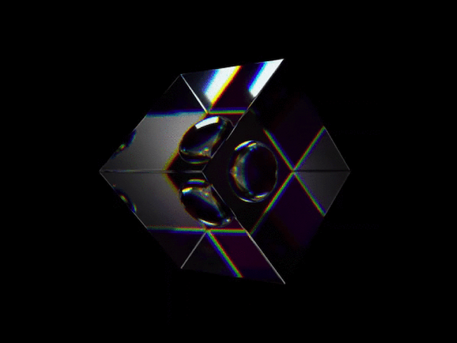
Morphing is an animation technique when one image or shape seamlessly transitions into another. Such metamorphosis can intrigue users and encourage them to stay longer on the page to see what the object turns into.
Consequently, it can optimize your SEO by encouraging your clients to spend more time on your app or website.
For example, this animated graphic morphs between a sphere and a cube as the image rotates.
Source: Nathan Riley
The effect is rather striking, so users are more likely to pause and watch it for more than a few seconds.
5. 2D + 3D
Combining 2D with 3D isn’t in the past. This year, the trend continues. Motion designers are still integrating both 2D and 3D into their works.
This animation, for example, is primarily 2-dimensional, but uses some 3D elements. The beginning of the animation features a two-dimensional cartoon drawing of a person, but it also uses shadows under the person’s feet and legs to create a 3D look. The phone also creates perspective and distance.
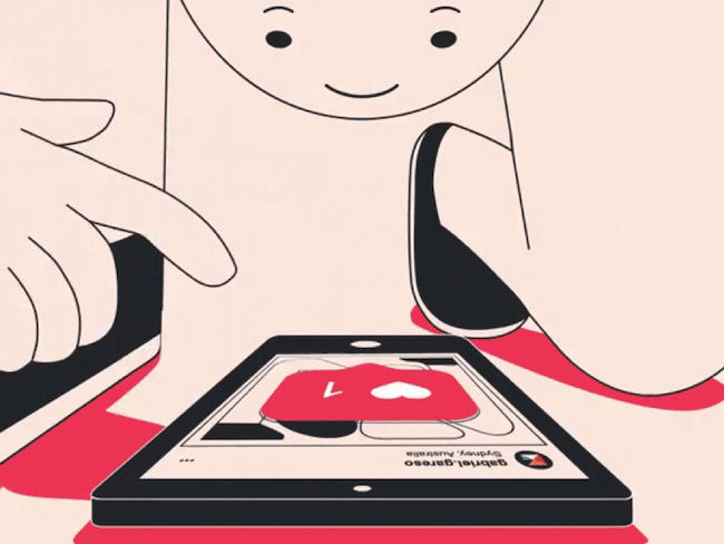
Source: Gareso
Then the cartoon gets “sucked” into the phone and social media, where it appears entirely two-dimensional.
The use of 3D and 2D elements emphasizes the designer’s point about social media addiction in the modern age.
6. Logo Animation
Your logo design is crucial for initial impressions of your brand. So, there is nothing surprising that logo animation is going to a new level.
Compared to static icons, images, or typography, animation offers a compelling vision of your logo and creates a statement for users' initial impression of your brand.
Slack implemented this trend when they launched their new logo. They took their old logo and broke it down into their brand’s primary colors. In this animation, their old logo becomes four dots — one green, one blue, one yellow, and one red.
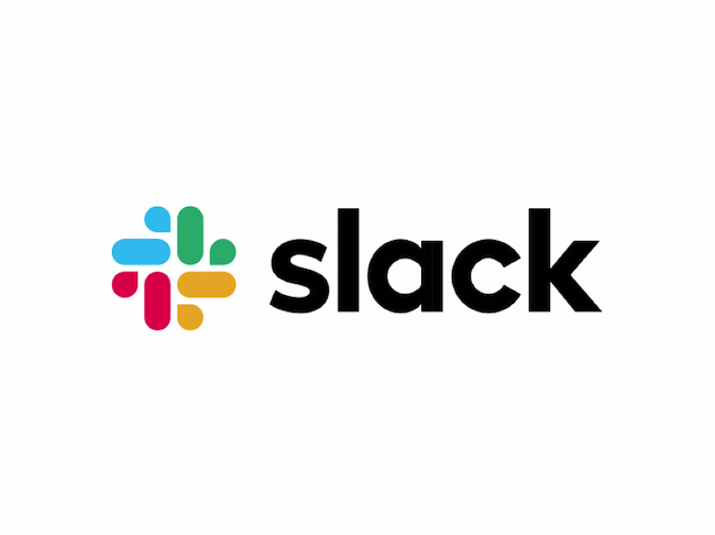
Source: Slack
Then they rotate 360º and reform into their new logo. At that point, Slack’s name appears next to the logo, making it clear what the animation is advertising. This was a great way for Slack to announce their new logo and show how things are changing.
7. Grain
Graining is a widespread technique of retouching photos to make them more realistic and natural. It allows companies to depict surfaces and textures more vividly. Recently, this UI animation is conquering video formats as well.
This animation by Humdinger & Sons features grain.
Source: Dribbble
The designer uses the technique and changes grain density for background elements in particular to make the character's movement more visible.
8. Buttonless Transitions
Buttonless transitions are an extension of upcoming animation trends grounded in simplicity and minimalism. In order to create smooth and simple transitions, designers avoid rough and sharp moves.
For example, designer Daniel Tan played around with this trend by reimagining Tokyo’s 2020 Olympic Sports website. To bring the dynamism and energy of The Games to life, they created a continuous animation sequence to demonstrate the user interface (UI).
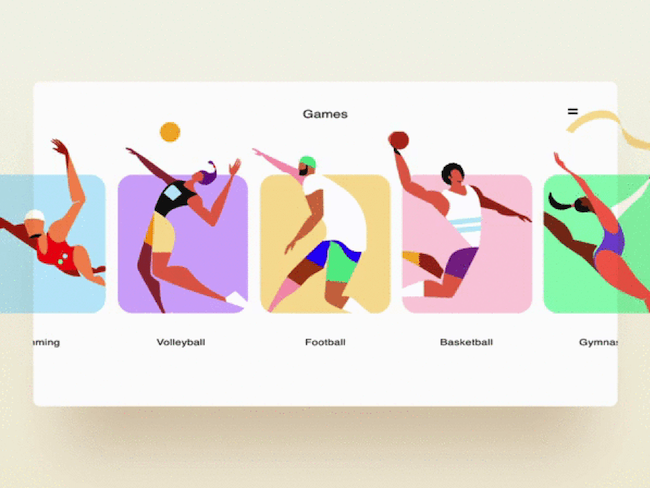
Source: Dribbble
If a user were to click on a sport, the animation zooms in and slowly evolves to reveal the results page, creating an explosive effect.
9. Futuristic Animations
Futuristic animations combine paradoxical objects, making them interact in the craziest way possible.
This design includes electricity running through a person’s ears, a water slide coming out of their mouth, and electric glasses.
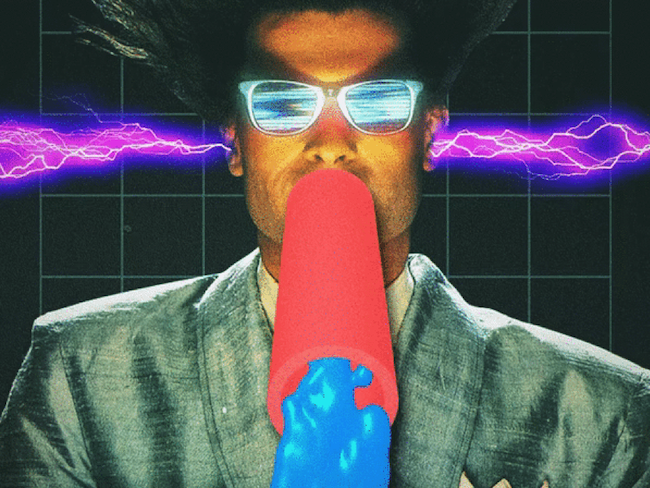
Source: Jay Sprogell
The animation is striking because all of the features are unique. Because they don’t typically go together, it catches the audience’s attention.
10. Roughness
Along with simplicity and minimalism, brutality has become a top feature among design work. Motion designers tend to combine rough sketches and unretouched videos to connect animations with reality.
Just look at this recent design from Square — clearly inspired by the ’90s, they use pop-ups, vibrant images, emoticons, and layers to create their aesthetic.
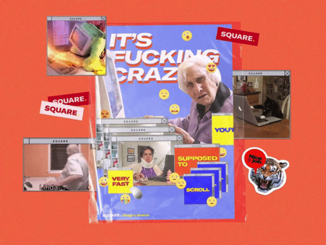
Source: SQUARE
The bright images and brutal elements juxtapose the minimalism generally seen online today.
Minimalism Leads Popular UI Animation Trends
Animations have become an indispensable part of any interface. They shape users’ perceptions, help us visualize things and make digital products not only more aesthetic but also simpler.
With tons of useful and appealing animations we see each day, there are certainly patterns and trends that stand out more. Thus, simplicity, minimalism, and realism have recently become leading trends.
To add simplicity and credibility to animation, designers have started to concentrate more on dimensions, grain, and smooth transitions among other techniques.
Partner with a mobile app development company to learn how to add these animations to your mobile app.